


Pearl Jam: Dark Matter Tour
Pearl Jam’s Dark Matter tour offered the perfect canvas for exploring a visual identity rooted in grunge. The band’s music has always carried a raw, rebellious edge, and the challenge was to create promotional materials that honoured that spirit while resonating with both loyal fans and new audiences.
The campaign drew heavily on the design language of David Carson, the pioneering creative director of Ray Gun magazine. Carson’s disregard for rigid grids, his strategic use of blur, and his fractured typography became touchstones for this project, reinterpreted through the lens of Pearl Jam’s atmospheric sound.
The task was to craft a tour identity that:
- Captured the texture and imperfection synonymous with grunge.
- Paid homage to Carson’s design legacy while avoiding pastiche.
- Balanced experimental aesthetics with clarity and legibility, essential for functional tour promotion.
Through analysing Carson’s work, I identified three strategies to carry into the Pearl Jam campaign:
- Broken Grids
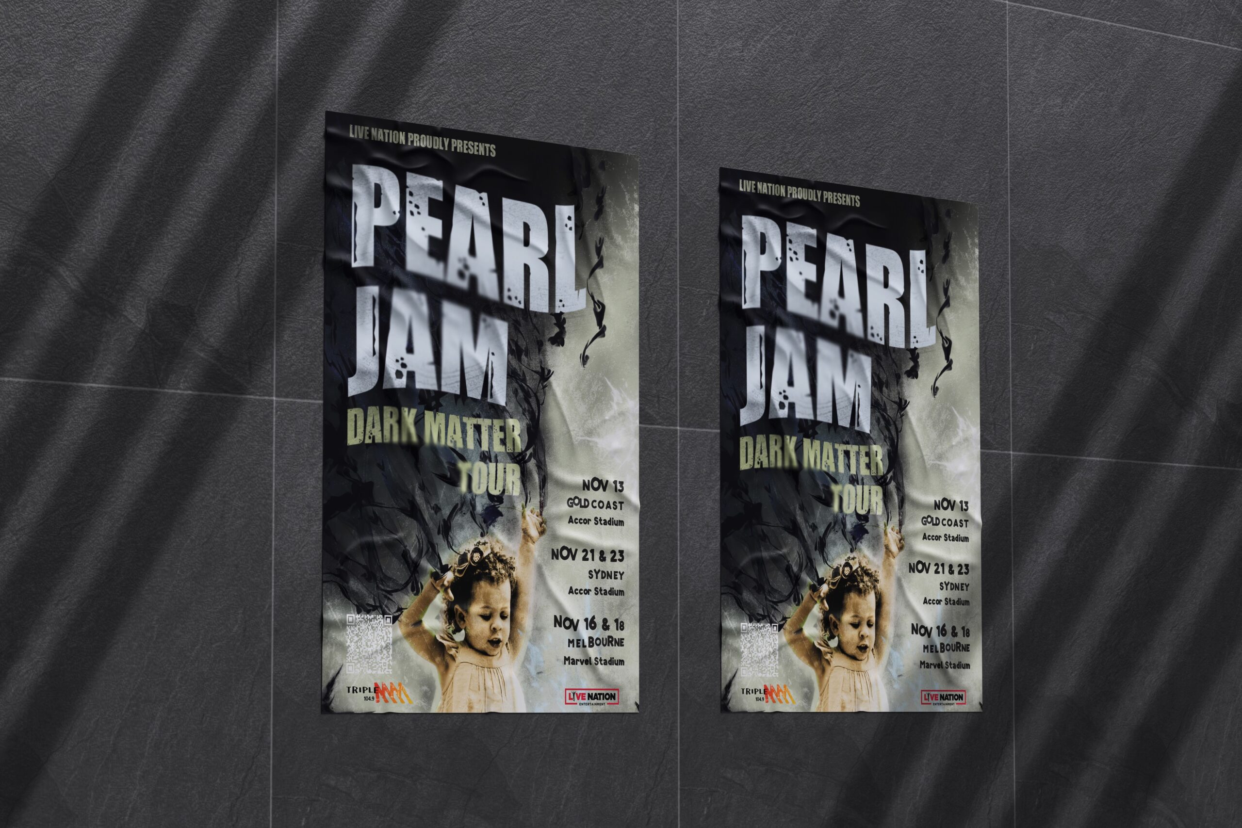
Carson’s layouts often aligned text to a single dominant element rather than a strict grid. For Dark Matter, this became a way to guide the eye toward the central illustration of swirling, hand-drawn “dark matter”, while tour dates adhered to traditional margins to respect reading flow. - Strategic Blur
Blur was used sparingly, referencing Carson’s analogue photocopy techniques. This created focal points amid heavy, dark visuals, echoing Pearl Jam’s layered sound where distortion and clarity exist side by side. - Disjointed Typography
Typography was warped and distressed (using fonts like Impacted 2.0), introducing texture without sacrificing legibility. Tour dates experimented with spacing and hierarchy, creating a fractured yet cohesive rhythm, much like Pearl Jam’s own balance of rawness and control.
The campaign assets included:
- Poster anchoring the identity, combining distressed type, blurred elements, and the “dark matter” illustration.
- Brochure and DL Flyer extending the design system into flexible layouts with muted palettes and gritty textures.
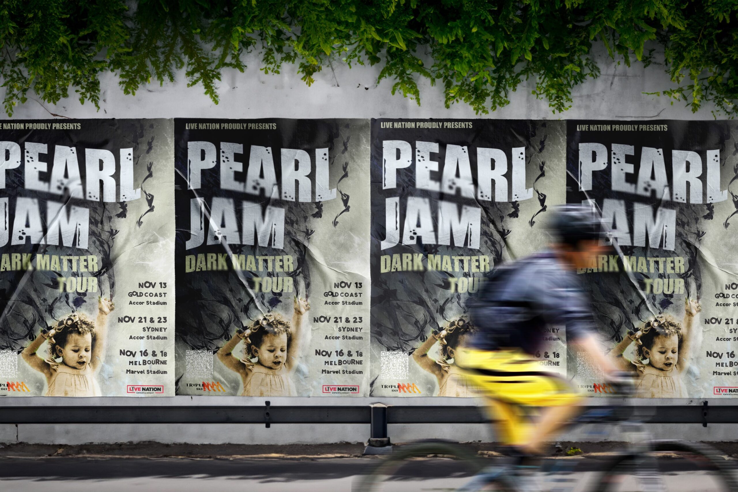
- Mockups demonstrating application across real-world contexts, reinforcing the campaign’s versatility.
The final suite is not simply a tour poster set, but a visual homage to both Pearl Jam’s musical legacy and the broader culture of grunge. By drawing on Carson’s hallmarks such as disjointed typography, broken grids, distressed filters, and muted tones, the designs feel authentically tied to Pearl Jam’s origins while still relevant to a contemporary audience.
For me, the project was about learning to break the rules with purpose. To deconstruct text, disrupt the grid, and embrace imperfection, all while maintaining respect for audience legibility. The result is a campaign that mirrors the ethos of Pearl Jam’s Dark Matter: raw, defiant, and enduring.